
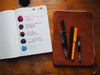
New J. Herbin Inks + Cornaline d'Egypte


***
In other news, I've been expanding my horizons dressing baby Naomi. I've never really been a fan of pink and frilly, and a shocking proportion of girls clothes seem to be pink these days. Recently, I've been a little worried about her growing up with a complex - she's bald, but then she's also dressed most of the time in her big brother's old clothes, and everything thinks she's a boy. It didn't matter when was an infant, but now that she's getting a little more aware of people around her, and people interacting with her, I've been trying to at least find more gender neutral clothes. I'm finally embracing one of my favourite outfits for her, her safari outfit. When I first got it, I really liked it, and actually didn't refer to it as a safari outfit but as "that cute beigy button up onesie." She's a baby that gets a lot of comments when we go out, but literally every time I put her in it, basically all of the comments are something along the lines of either "are you ready for your safari?" or "you look ready for a safari!" It probably also doesn't help that she's gotten really tanned over the last few months so she looks like she's been spending time out in the jungle. For some reason that's really completely beyond me, it sort of bothered me, this constant reference to this imaginary safari, and then every comment I continued to get just added to my irrational agitation. She's a baby! She's not going on a safari! We're here to get her vaccinations! Or a coffee! Or wandering down the aisles of No Frills trying to decide on a box of crackers! It finally dawned on me one day that there are bigger fish to fry in the world, and now I just smile, and say yes, she is in fact prepared to go on a safari. If only she was so lucky.

Related Posts
Currently Inked During Winter Lockdown
New inks into freshly washed pens! Noodler’s Black Swan in Au...

A Mystery Sample Pack Revealed
I recently did a survey on Instagram about what kind of blog posts peopl...
Not Traveling in my Traveler’s Notebook
Not traveling much these days! I miss the excitement of even shorter roa...


Comments
blog3002.xyz said:
Thanks for one’s marvelous posting! I really enjoyed reading it,
you’re a great author.I will be sure to bookmark your blog and will
come back someday. I want to encourage you to ultimately continue your
great work, have a nice morning!
blog3002 said:
excellent publish, very informative. I’m wondering why the opposite experts of this sector do not realize this.
You should proceed your writing. I’m confident, you’ve
a huge readers’ base already!
Bert Carson said:
Naomi is beautiful. Your J. Herbin review is wonderful. One question – tell me about the notebook: Brand, size, your impression of it.
Thanks,
Bert
Anonymous said:
Thank you! :)
Anonymous said:
She is definitely channeling a lot of her energy into growing those cheeks. And I’m loving the inks, too!
Jessica said:
Oh my goodness, Naomi is so adorable – those cheeks! And the inks look delicious.
Susan White said:
She’s adorable!