8 Newly Re-released Four Seasons Inks from Sailor
A while ago, Sailor discontinued the colours of their standard line, except for Black, Blue and Blue-Black to re-release eight of their sixteen "Four Seasons" ink colours. We've had these inks for a while, and they're some of our most popular - Yama-Dori (teal), Souten (bright blue), Tokiwa-Matsu (warm green) and Oku-yama (dark red) in particular. Sailor has just released, for a limited time, the remaining eight of the sixteen Four Seasons inks, and they are beautiful. You can see all of our Sailor inks, including the new ones, here on the website, or of course come and visit us in the shop. Sailor Chu-Shu: grey purple Sailor Kin-Mokusei: orange Sailor Sakura-Mori: pink Sailor Irori: red Sailor Fuji-Musume: purple Sailor Yuki-Akari: blue/turquoise Sailor Waka-Uguisu: green Sailor Rikyu-Cha: brown  Chu-Shu: dark + dusky greyish purple One of my favourites of the eight - I'm normally not a grey ink person unless it has something else to it, and I don't especially like it when the greys are light, like Gris Nuage, because I can only use them in very broad nibs. Chu-Shu is a lovely, charcoal, purply grey ink that writes wet and smooth onto the page.
  Sailor Chu-Shu
  Sailor Chu-Shu Kin-Mokusei: bright orange It's truly a very bright orange, not quite a match for the discontinued Apricot, but not far off. Kin-Mokusei has some great shading, which isn't particularly clear here because my Konrad is very wet - it pools ink onto the page, which is sort of how I like it because I want to be able to flex shamelessly, but it's not great for showing off shading - and it also has a very subtle pink sheen if it's wet enough.
  Sailor Kin-Mokusei
 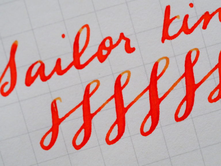 Sailor Kin-Mokusei
  Sailor Kin-Mokusei Sakura-Mori: warm + dusky pink I know I describe it as warm and dusky, and it looks a bit bright in the swab, but I think that's more because of the light sheen that comes off of it at an angle. When it comes out of a pen, though, this ink really surprised me. I am definitely not really a pink ink person, but this ink has a really nice matte quality to it, with just a hint of a crisp darker and slightly shining edge around it. I used a TWSBI Mini Broad which is also a bit on the wet side, so that might have something to do it with it.
  Sailor Sakura-Mori
  Sailor Sakura-Mori Irori: cheerful + fun red, with hints of pink + orange I thought Irori, the bright red ink, might be one of my least favourites (even less than pink, since red sometimes comes across as a bit angry), but it was another surprise with how bright and cheerful it was as a red. It could also be the Platinum nib: I had swapped out my gold-coloured broad nib with a customer for a silver-coloured medium - at the time I said it wouldn't bother me that my pen and nib colour don't match, but it turns out I'm a bit more shallow than I thought, and I haven't inked it up too much. But every time I do, I remember how nice Platinum nibs are - or maybe it's the ink??
  Sailor Irori What really makes it a beautiful ink, though, is its sheen - it's crazy! I wish I had known this before I selected my relatively fine Platinum nib. If you try really, really hard, you can see a hint of the sheening in the writing sample, but I think for it to be really apparent, you need a broader nib.
  Sailor Irori Fuji-Musume: purple A bit of a dusky purple, a bit of a good match against the pink Sakura-Mori. The swab also looks a bit brighter, I think because of the angle, and because of how wet the swab laid down is.
  Sailor Fuji-Musume
  Sailor Fuji-Musume Yuri-Akari: bright, light peacock blue This another fun and bright and friendly blue ink. At first I thought it was a spring ink, but it's actually aligned with the winter season, and the more I think about it, it's a bit wintry too.
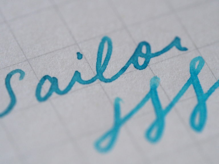
 Sailor Yuki-Akari Wake-Uguisu: warm green I am a big fan of earthy and warm colours, and this one is right there - and the shading! How can I resist an ink that shades like this. How beautiful and inky and vintage-y it looks on the page. I used my Franklin-Christoph Fine nib, which is another fairly wet nib.
  Sailor Waka-Uguisu
  Sailor Waka-Uguisu
  Sailor Waka-Uguisu Rikyu-Cha: goes on green but turns into a dark greenish brown This is my favourite of the eight. It's brown! But it's such a wonderful, deep, rich, complex brown. It actually goes on green, and then dries to this brown with a hint of the richness of the green, and if you look really carefully, a bit of gold sheen in it. I love these sorts of secret things that happen when you write. It's not a greenish brown that looks kind of unappealing, it's a rich brown that has undertones of green and shades of brown.
  Sailor Rikyu-Cha
  Sailor Rikyu-Cha
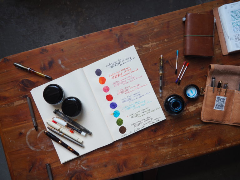 I think I might be biased because Sailor inks are some of my absolute favourite - their old Sky High, Tokiwa-Matsu, Do-You are all regulars in my rotation. Their colours are so unique - rather than having ten shades of red, they just have the one or two really beautiful ones. But I think more so because the inks tend to all be so smooth and wet but also have a tactile feel to them, enough to not be glassy but to feel just right across a page. This is going to sound crazy, but I even sort of like that distinctive Sailor ink smell that they have. It's funny because a customer came into the shop the day we first day we had them out and took a look at all the swabs. He ended up picking six of the inks: all of the inks minus Chu-Shu (the dark grey) and Rikyu-Cha (the brown), which are my favourite two of the whole batch. I didn't think too much about it at the time, but upon reflection, I feel a bit as though all of those bright and vibrant inks might be a reflection of his bright and cheerful nature - and conversely, my soul might be a bit dark and twisty, with my favourite inks among such bright and beautiful colours being the green that turns into brown, and a dark purplish grey. I guess I did also like the pink one. Anyone else have any favourites from this new line?
 Chu-Shu: dark + dusky greyish purple One of my favourites of the eight - I'm normally not a grey ink person unless it has something else to it, and I don't especially like it when the greys are light, like Gris Nuage, because I can only use them in very broad nibs. Chu-Shu is a lovely, charcoal, purply grey ink that writes wet and smooth onto the page.
  Sailor Chu-Shu
  Sailor Chu-Shu Kin-Mokusei: bright orange It's truly a very bright orange, not quite a match for the discontinued Apricot, but not far off. Kin-Mokusei has some great shading, which isn't particularly clear here because my Konrad is very wet - it pools ink onto the page, which is sort of how I like it because I want to be able to flex shamelessly, but it's not great for showing off shading - and it also has a very subtle pink sheen if it's wet enough.
  Sailor Kin-Mokusei
  Sailor Kin-Mokusei
  Sailor Kin-Mokusei Sakura-Mori: warm + dusky pink I know I describe it as warm and dusky, and it looks a bit bright in the swab, but I think that's more because of the light sheen that comes off of it at an angle. When it comes out of a pen, though, this ink really surprised me. I am definitely not really a pink ink person, but this ink has a really nice matte quality to it, with just a hint of a crisp darker and slightly shining edge around it. I used a TWSBI Mini Broad which is also a bit on the wet side, so that might have something to do it with it.
  Sailor Sakura-Mori
  Sailor Sakura-Mori Irori: cheerful + fun red, with hints of pink + orange I thought Irori, the bright red ink, might be one of my least favourites (even less than pink, since red sometimes comes across as a bit angry), but it was another surprise with how bright and cheerful it was as a red. It could also be the Platinum nib: I had swapped out my gold-coloured broad nib with a customer for a silver-coloured medium - at the time I said it wouldn't bother me that my pen and nib colour don't match, but it turns out I'm a bit more shallow than I thought, and I haven't inked it up too much. But every time I do, I remember how nice Platinum nibs are - or maybe it's the ink??
  Sailor Irori What really makes it a beautiful ink, though, is its sheen - it's crazy! I wish I had known this before I selected my relatively fine Platinum nib. If you try really, really hard, you can see a hint of the sheening in the writing sample, but I think for it to be really apparent, you need a broader nib.
  Sailor Irori Fuji-Musume: purple A bit of a dusky purple, a bit of a good match against the pink Sakura-Mori. The swab also looks a bit brighter, I think because of the angle, and because of how wet the swab laid down is.
  Sailor Fuji-Musume
  Sailor Fuji-Musume Yuri-Akari: bright, light peacock blue This another fun and bright and friendly blue ink. At first I thought it was a spring ink, but it's actually aligned with the winter season, and the more I think about it, it's a bit wintry too.
 Sailor Yuki-Akari Wake-Uguisu: warm green I am a big fan of earthy and warm colours, and this one is right there - and the shading! How can I resist an ink that shades like this. How beautiful and inky and vintage-y it looks on the page. I used my Franklin-Christoph Fine nib, which is another fairly wet nib.
  Sailor Waka-Uguisu
  Sailor Waka-Uguisu
  Sailor Waka-Uguisu Rikyu-Cha: goes on green but turns into a dark greenish brown This is my favourite of the eight. It's brown! But it's such a wonderful, deep, rich, complex brown. It actually goes on green, and then dries to this brown with a hint of the richness of the green, and if you look really carefully, a bit of gold sheen in it. I love these sorts of secret things that happen when you write. It's not a greenish brown that looks kind of unappealing, it's a rich brown that has undertones of green and shades of brown.
  Sailor Rikyu-Cha
  Sailor Rikyu-Cha
***
We just got these inks in the shop this past week, and already I am debating with Jon over what exactly the advantages of opening an ink stop are if you can't shore up enough ink to last you through any future ink apocalypses. Jon is debating with me over the fiscal responsibilities of running a business, and also the definition of hoarding. These inks are only around for a limited time, which only adds to my angst. This is one of those times when my fingers are heavenward in the air and my face looks like an emoticon (the one with tears streaming down), but I'm going to tough it out. I think I might be biased because Sailor inks are some of my absolute favourite - their old Sky High, Tokiwa-Matsu, Do-You are all regulars in my rotation. Their colours are so unique - rather than having ten shades of red, they just have the one or two really beautiful ones. But I think more so because the inks tend to all be so smooth and wet but also have a tactile feel to them, enough to not be glassy but to feel just right across a page. This is going to sound crazy, but I even sort of like that distinctive Sailor ink smell that they have. It's funny because a customer came into the shop the day we first day we had them out and took a look at all the swabs. He ended up picking six of the inks: all of the inks minus Chu-Shu (the dark grey) and Rikyu-Cha (the brown), which are my favourite two of the whole batch. I didn't think too much about it at the time, but upon reflection, I feel a bit as though all of those bright and vibrant inks might be a reflection of his bright and cheerful nature - and conversely, my soul might be a bit dark and twisty, with my favourite inks among such bright and beautiful colours being the green that turns into brown, and a dark purplish grey. I guess I did also like the pink one. Anyone else have any favourites from this new line?


Comments
https://blog.follows4free.com said:
I just want to say that I freaking LOVE this blog! It’s one of the three sites that I check every single day! Please keep posting more content :)
Get More Views said:
Old post but I still enjoyed it! Thank you!
TWSBI ALR-Purple - Wonder Pens - Life Behind a Stationery Shop said:
[…] shading! Sarah: 580 AL Green with Sailor Waka-Uguisu (it looks slightly browner here than I think it usually does, but that could be a combination of lighting and my imagination?) Liz: Mini AL Gold – Diamine […]
Anonymous said:
How exciting! Congratulations are in order :)
Hope you really enjoy your first fountain pen – it’s a rabbit hole, especially with all of the inks! And a selection of ink samples is the best way to go about it, lots to choose from, and each ink has its own sort of personality. Hope to catch you when you visit! :)
Anonymous said:
Glad to hear of another kindred spirit! I’ve always loved warm and brown and earthy inks :) Hope you get a chance to try a few!
Anonymous said:
The Kin-Mokusei is a bit of a brighter orange, and has a bit less shading than Apache. Hope that helps!
Anonymous said:
I’ve got a soft spot for inks, that’s for sure! :)
Anonymous said:
Tokiwa-Matsu and Souten are favourites of mine, too, and I know just what you mean about Chu-Shu, being very dark. I love these sorts of inks that can give a bit of a double take – hope you get a chance to try it, let me know what you think! :)
Lily said:
Tokiwa-Matsu and Souten are regulars in my rotation. I may have to add Chu-shu to my collection as it looks to be a regular professional colour when you glance at it, but then upon closer look it’s just a little different to make it stand out against the standard blue and black.
Angelina said:
Lol you literally just revealed your true nature to all your readers :D
J. said:
I don’t even own a fountain pen yet but I’m so pumped about these ink choices! This is the first blog post of yours I read and I quite enjoyed your writing style.
Hoping to stop by the shop tomorrow to pick up my first pen and selection of ink samples!!
Claudia said:
Gosh these are lovely! I’m like you, my favourites are the three dark earthy ones, yum!
Kate W said:
How does the Kin-Mokusei compare to Apache Sunset?
Anonymous said:
I have not yet started tasting the inks, haha! Thanks so much for reading and taking the time to write – glad to know I am not the only one who likes the darker inks :)
Storm said:
I love the same two as you do – I have a couple of bottles stashed from their previous release….might have to add to that!
Bit disappointed you haven’t taste tested these inks… :)
Love the photos they give a really good idea as to the wonder of these inks. Thank you.