
TWSBI Nib Size Comparison

TWSBI is one of our most popular pen brands, and it’s also a personal favourite of mine. We’ve been carrying it for years now, since our earliest days at 906 Dundas West, and it’s been excited to watch them expand their lines and release special editions. As a retailer, TWSBI is also one of our favourites to do business with, pandemic or otherwise.
I have been long remiss in not having all the nib sizes together on a page to compare. I have occasionally done writing samples of one or another, but it’s difficult to compare when they’re not on the same blog post (or paper, or using the same ink, etc.).
The usual caveats: everything is quite dependent on your ink and your paper. The more absorbent your paper, the more the ink will spread out, and your lines will appear thicker. Different inks also behave differently, some a bit drier, with less ink coming out onto the page, and giving a thinner line. Even how much pressure you write with can affect how broad the line is on the page.
I lack the ability and the tools to be precise with digital calipers or gauges, but I am hoping this post will give you an idea of how the nib sizes compare against each other and what it looks like on the page, especially if you’re trying to decide something like if you should get the extra fine or the fine.
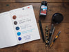
The ink is Noodler’s Raven Black, a fairly wet black ink, and a Rhodia top spiral A4 pad. I am normally a loyal user of the yellow Rhodia pad, but it’s not always the best for a more neutral photograph (as neutral as my photos can get, in any case).


Over the years, I have skated back and forth from one end of the nib sizes to the other, with admittedly only short dalliances with the 1.1 stub. My handwriting is too wayward to make any use of the stub nib, although some might argue that wayward handwriting is the perfect candidate for a little extra help. I think I’m beyond that. My circle letters (e, a, o) tend to get a bit too jumbled up and illegible when the nib is too wide. I mean, I guess they do that no matter what. Let’s not get into it.
I find TWSBI nibs to be slightly finer than Lamy nibs, but definitely not as fine as Japanese nibs like Pilot.
I have historically chosen broad nibs, liking to see the ink shading in particular, but over time, I’ve found I reach for my fine nibs the most. I like how they feel on the page when I’m writing with them. My favourite fine nib is on my TWSBI AL-Mini Blue. Even my extra fines are great for when I’m trying to take some quick notes. I do still have my broads, and when I sit down for a letter or a thank you note, I love seeing the personality of a pen and ink on a page.

Related Posts
Currently Inked in February
It’s February, and here I am with a few new inks in my pens. J. H...
My 2021 Analogue System
I try to do this post every year, a look at what notebooks and plan...

Currently Inked During Winter Lockdown
New inks into freshly washed pens! Noodler’s Black Swan in Au...


Comments
Caro said:
Thanks so much for this, Liz. I am slowly wading into the world of fountain pens, and your blog posts have been so helpful. I agree with Bob — I think your stub nib writing looks great!
Michelle said:
Thanks so much for this post. I had an out of stock alert set up for a purple one that glows in the dark and I was wondering what size to order. My only experience with fountain pens is from a couple of really cheap ones (not refillable). I’m a hard writer so I definitely can’t stand anything scratchy or too watery – it’s kind of like a catch 22 lol! From reviewing this I feel like fine or medium might be best for me to try. FYI: Will be used mainly in my planners and notebooks which tend to have a decent weight paper – around 32lb I believe (in case this helps with any recs or tips). If anyone has any suggestions please lmk! 😊
Win said:
I wish pen descriptions listed the height of the nib! I tend to choke down on pens. Tall nibs mean I’m grabbing the feeder rather than the grip. I’ve pretty much settled on Lamy AL-star or Safari; a lot of expensive pens use beautiful tall nibs that I just can’t write with.
Frank said:
I was wondering if you could do an additional sampling, the eco in both F and EF on poor quality papers such as photocopy paper the Canadian government would use, lower quality notebooks such as “studio” wire bound notepads from dollarama? Thanks so much! :)
Ching said:
Thanks for the details! I got the broad nib based on your blog/review.
Anonymous said:
Hello! The 1.1 Stub refers to the shape of the nib, being 1.1 mm across. The pen itself is the same size and shape across all nib sizes, it’s just the tip that changes. Hope that helps!
Rachel said:
Hi! I’m interested in getting one of these pens, but not sure about the nibs.
I love a SMOOTH (ie not scratchy) extra fine, or fine nib.
When I go to select the nib for the TWSBI ECO-T Fountain Pen – Coral, the choices are “Broad” or “1.1mm”.
I’m a bit confused about your stating the “1.1 Stub”…. I’m not sure what the Stub part means. I know for sure that I do not like a stubby/short pen, at all.
Hoping you can help me with this.
Cheers!
Josiane said:
Thank you very much, Liz, for doing this comparison post! I’ve had a TWSBI pen on my wishlist for a while, and have been wondering which nib size to choose. Given that I’m too far to come try them in the shop, this is really helpful. Although I can see now I may need (want) more than one… so the question has become which one I’ll get first!
João A. Branco said:
I am a fountain pen enthusiast from Brazil, and I really liked the post above. My favourite nibs are fine and medium, depending on the different brands. I like the old time’s Parkers, like models 51, 61 & 75. Pilot, Pelikan and Diplomat are nice, as well.
Thanks, looking forward to new posts.
Bob said:
I recall reading a real story by a buddhist monk, telling that each time people visited their monastery in Australia, he pointed to the two or few misaligned bricks in the wall he had built… No one saw them but him…
It’s the wall that counts and not the bricks…
Your handwriting is quite lovely, IMHO. Especially the stub nib samples…quite a delight….:)