
Pilot Inks: Black, Blue-Black and Blue
We have been running a stationery shop now for going on eight years and in that amount of time, we’ve always contemplated why we carry Iroshizuku inks but not the standard Pilot inks, and for some reason, we never took action on these ponderings. It was one of life’s great mysteries.
And then one day, we just decided to start carrying them. Ah, the vagaries of a stationery shop’s ordering decisions.
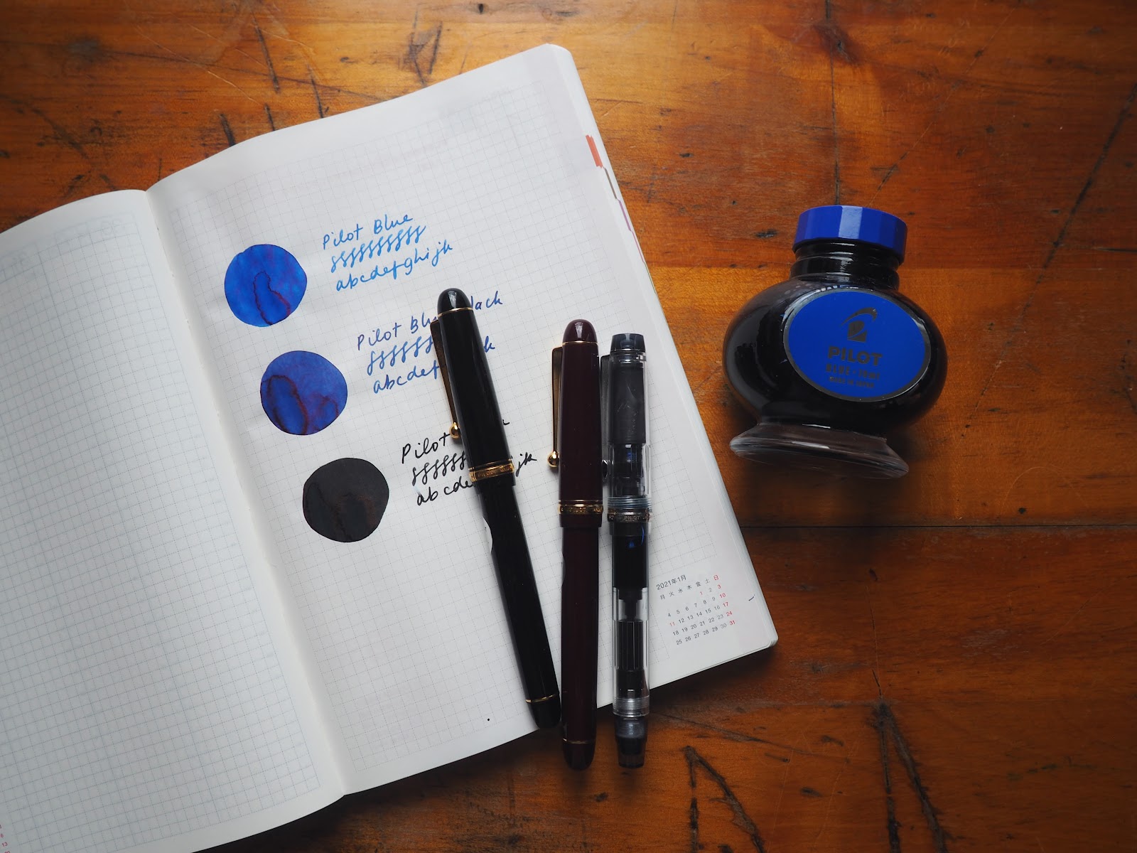
These are classic inks, no nonsense workhorses, especially compared with the quasi-luxury of the rainbow of Iroshizuku inks: there’s a blue, a blue-black and a black.
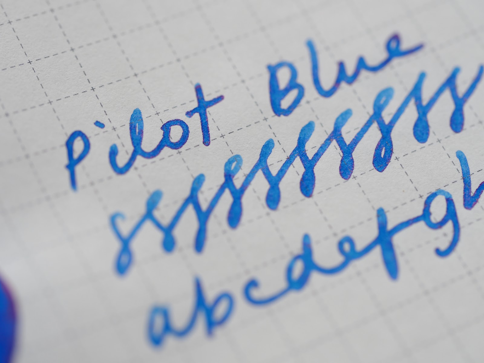
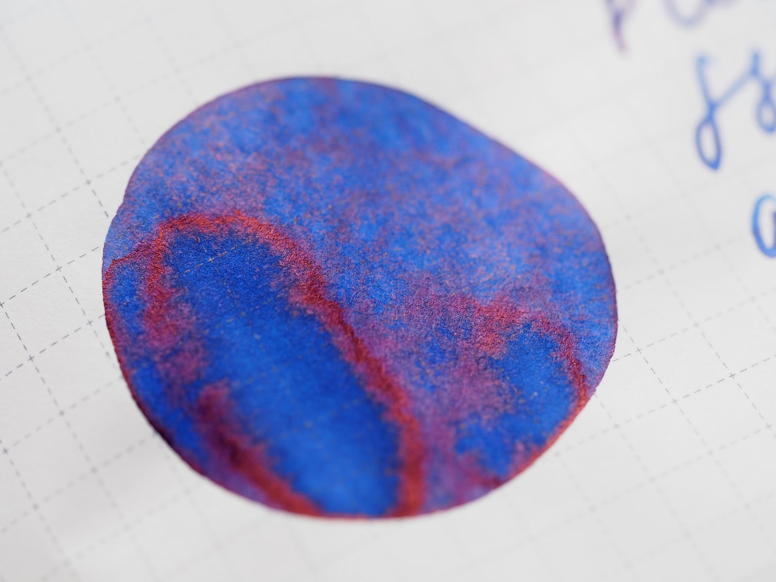
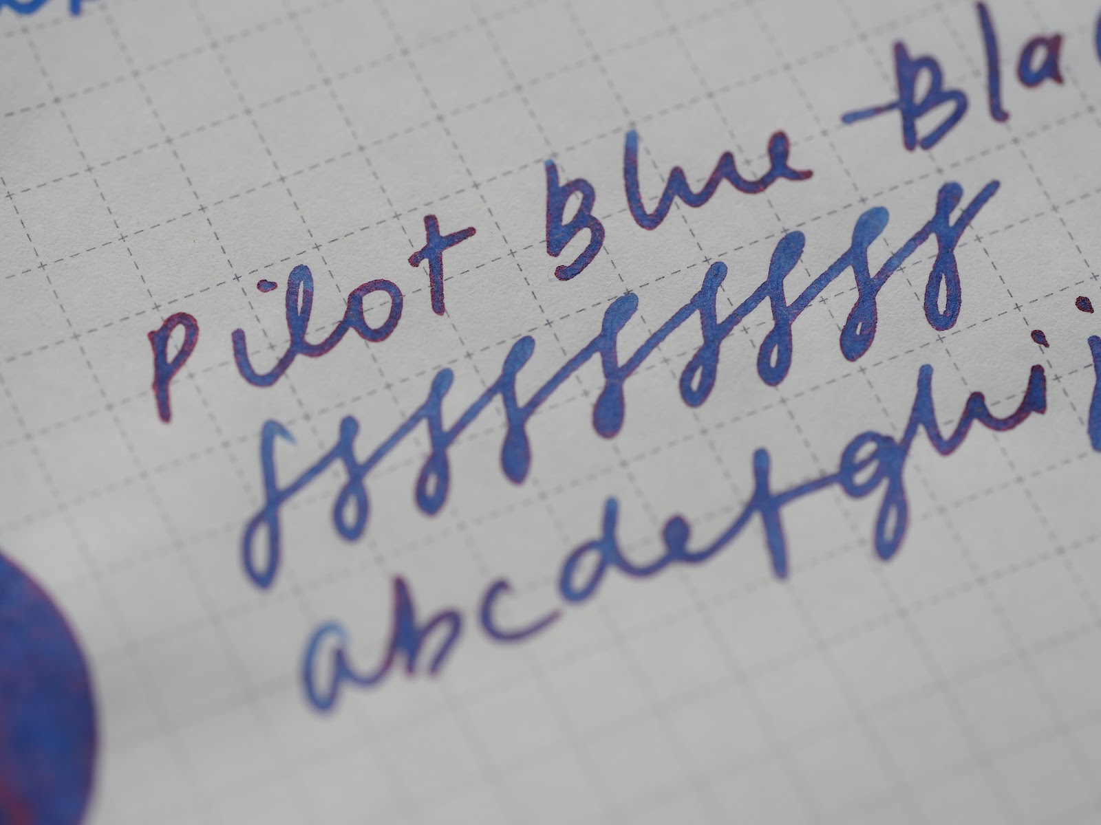
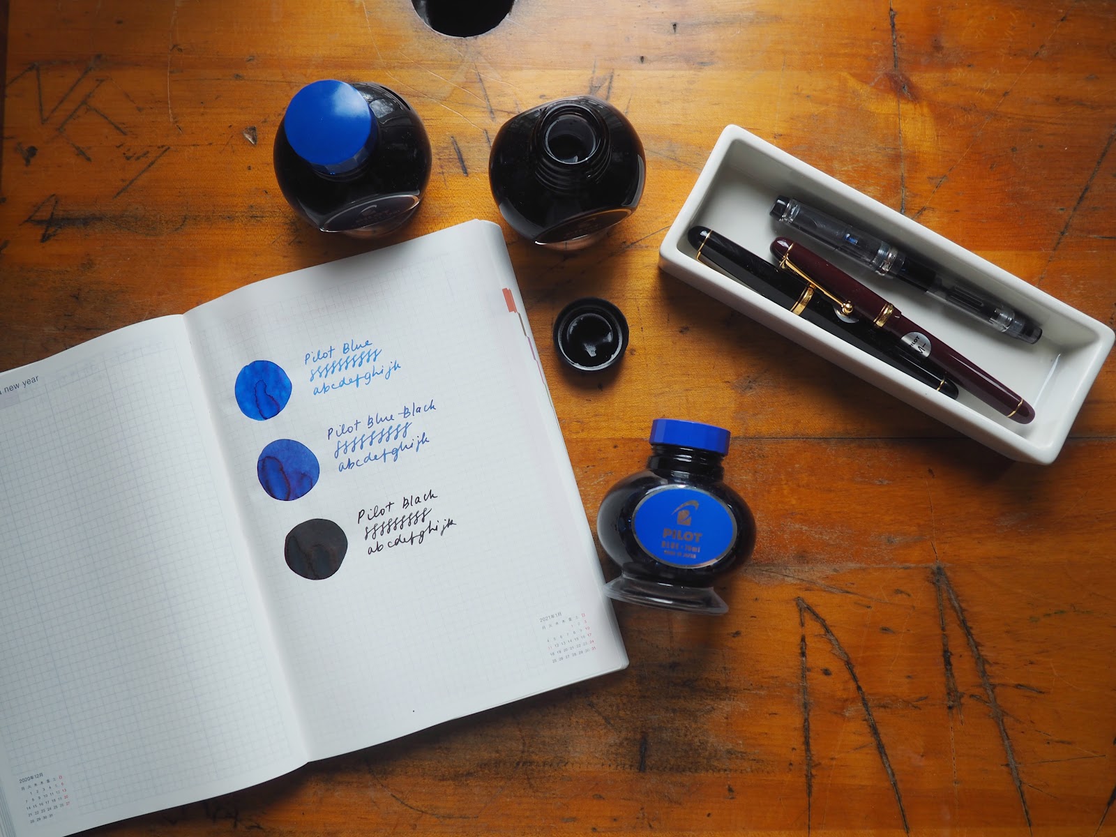
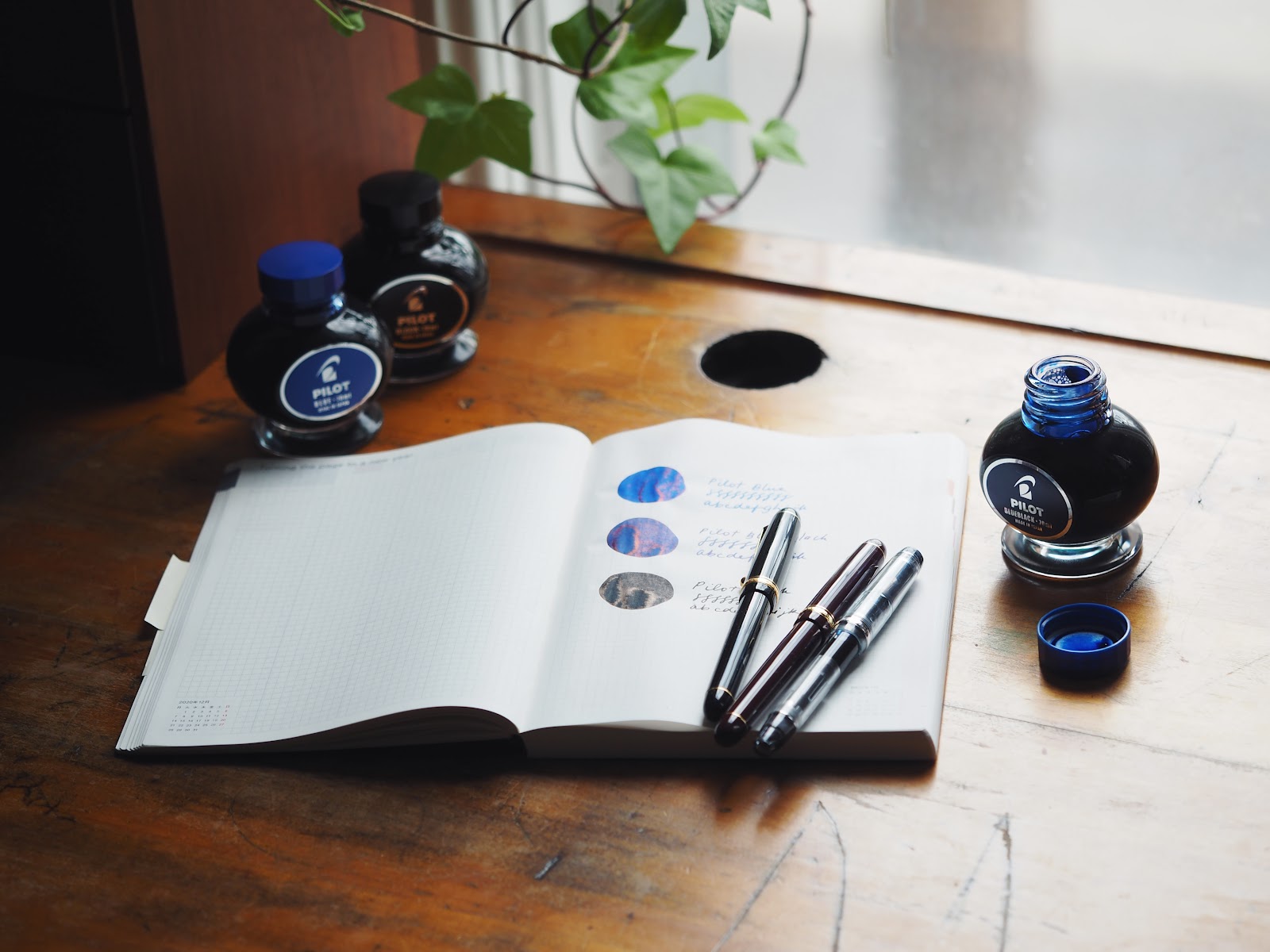
Here, below, are the swabs and writing samples of them. The blue and the blue-black look quite similar, a result of both being fairly similar and my poor photography skills. If you look at the pictures where you can see both of the colours you can see the difference more clearly.
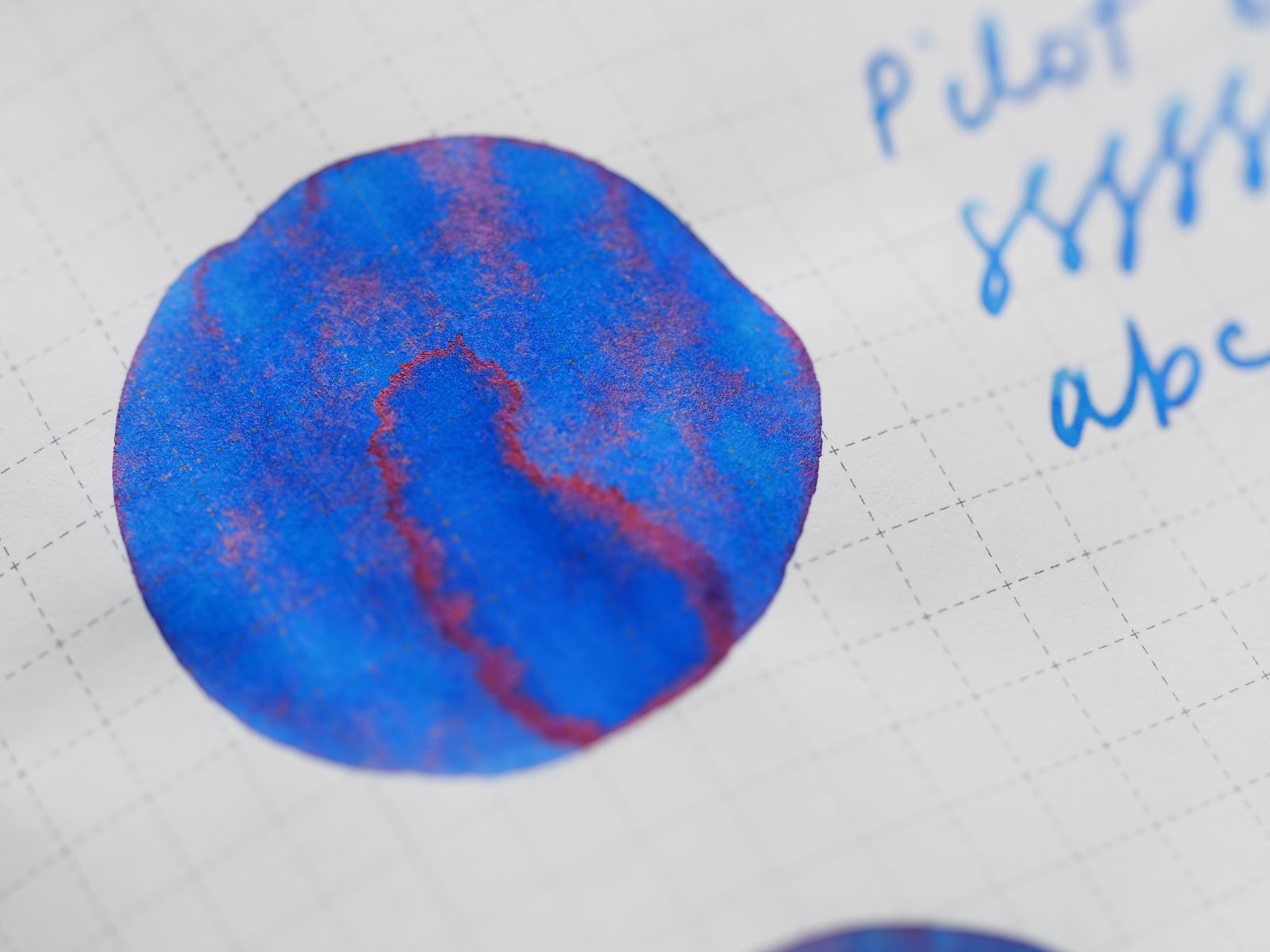
Pilot Blue: a nice bright, sky blue.
Pilot Blue-Black: darker, maybe a hint of purple in there.
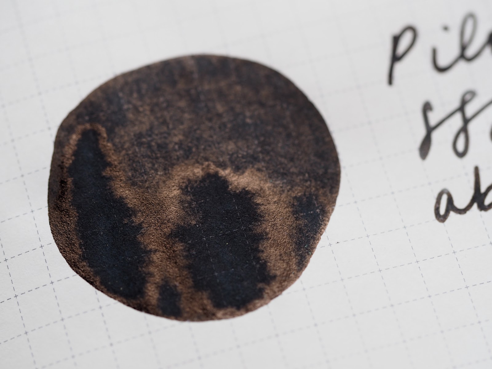
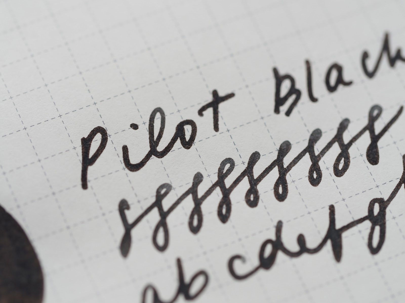
Pilot Black: a very smooth, dark, even black.
There is a bit of a sheen on the inks, although you will need good paper (this is Tomoe River, in my Hobonichi), and a wetter nib, and also a willingness to look closely at the paper. All three of these are great, standard inks for the workplace, studying, journaling. A bit of an old-school bottle as well. In my next life as a minimalist, I might consider this to be my bottle of ink.
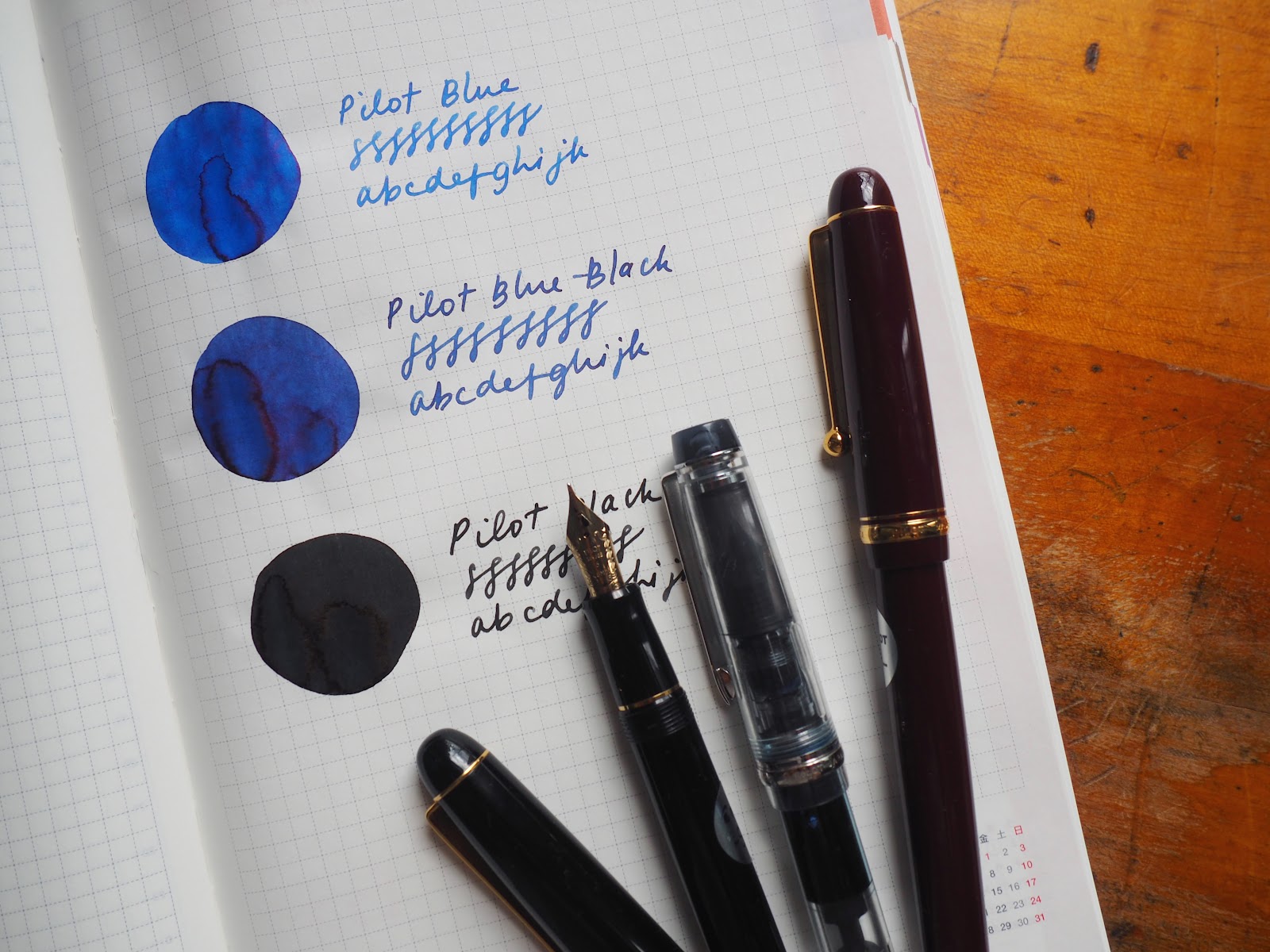
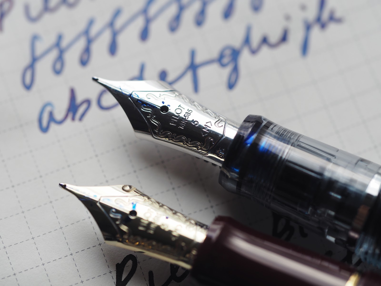
The three pens are all Pilots, and these three are often in my rotation: a Black Custom 74 with a soft medium nib, and both my Custom 92 in clear and burgundy Custom 74 have the (standard)medium nib. All three of these pens are terrific writers, the nibs are slightly bouncy, but they have reliable flow and feel great on the page.
***
Here we are in the new year, and I continue to blather on about some of my favourite stationery things. New year, new Liz, so perhaps this will be the year I finally cut down on some of my rambling. Only time will tell.
Lots of unfinished things planned for the blog from 2020, some of which will carry over into 2021, some of which, for better or worse, will never see the abyss of the published internet. The end of the year snuck up on me and already we’re a week into this new, disastrous year, surrounded by the accoutrements of virtual school, overdue library books, cranky cats, spilled ink. Naomi’s preschool teacher sent me a photo of Naomi’s hands, covered in Ancient Copper, which is how we sent her to school, asking if I knew what it was. If that isn’t an indication of what’s ahead, I don’t know what is.
Related Posts

Homeschooling Supplies
One unexpected pleasure of homeschooling has been amassing all the schoo...

Some of My Favourite Desk Tools
Some of us are working from home more than usual. While the fountain pen...

Currently Inked
I’ve mostly been using the shop tester pens, but after seven weeks of it...


Comments
Sarah said:
Hahaha that ending cracked me up. Naomi’s preschool teacher wondering what the heck is that stuff on her hands!? That’s definitely an interesting start to the year!
These inks are really beautiful! I really love the blue black actually, I’ve not been a fan of writing with blue ink since I fell in love with black gel pens, but blue black is a nice in between that could definitely tempt me.
Always enjoy these blog posts Liz. I’m a rambler too so it’s fun to read someone else’s rambles :)