J. Herbin 1670 Anniversary Ink Bleu Ocean
Things are hustling and bustling over here! We've had our grand re-opening this weekend, and that first Saturday we were open, there was a lot of, "oh yeah, converters, right...we need those to sell with the pens" or "hmmm right...those notebooks come in dot grid and ruled...", We had a busy Monday with errands and some family obligations, but there's no rest for the weary! I kind of thought that after we opened, it would be all settled and we could relax and enjoy some coffee while sitting back in the new shop. There are still ink samples to be made, a few items lost in the wilderness of half-unpacked boxes that need to be rescued, some scary looking boxes of "miscellaneous" goods. I think Jon's biggest disappointment in moving here is that the coffee machine is in the apartment, so he has to leave the shop, walk through the packing area and into the apartment to refill his mug... We have a few boxes of inventory from some of our distributors, and we have more expected soon, which we're really looking forward to. We tried to keep our stock as even as possible gearing up for the move, but now that we're here, we've been scrambling to fill up the missing stock. But the big news is that we just got our shipment of J. Herbin's 1670 Anniversary Bleu Ocean! We've had a lot of questions about these inks and when they were coming, but we've been a little distracted by the moving.
 If you've been in our new shop, you'll know that there are four steps down from the entrance. When the Canpar delivery man arrived with the two giant boxes of ink stacked on his trolley, he and I both looked down the steps. I was going to call Jon to help him lift the boxes down the steps, but before I could, the Canpar guy just wheeled them right now, with an oomph and a bump at every step. I almost had a heart attack. I mean, it's not that I have trust issues with all new delivery people on this side of town, but...that's some exciting ink I've got packed in those boxes. The Bleu Ocean is a reformulation of one of the now three 1670 Anniversary Inks from J. Herbin. Rouge Hematite has been around for a while, a rich red ink with goldish green sheen, which I used for basically all of my Christmas cards. Stormy Grey came last year, grey with gold flakes, and there was a bit of a crazy rush to grab those few bottles in the initial shipment, but we've got more now. The grey is really also a beautiful ink because there aren't too many great grey inks, and this one has some really spectacular gold in it.
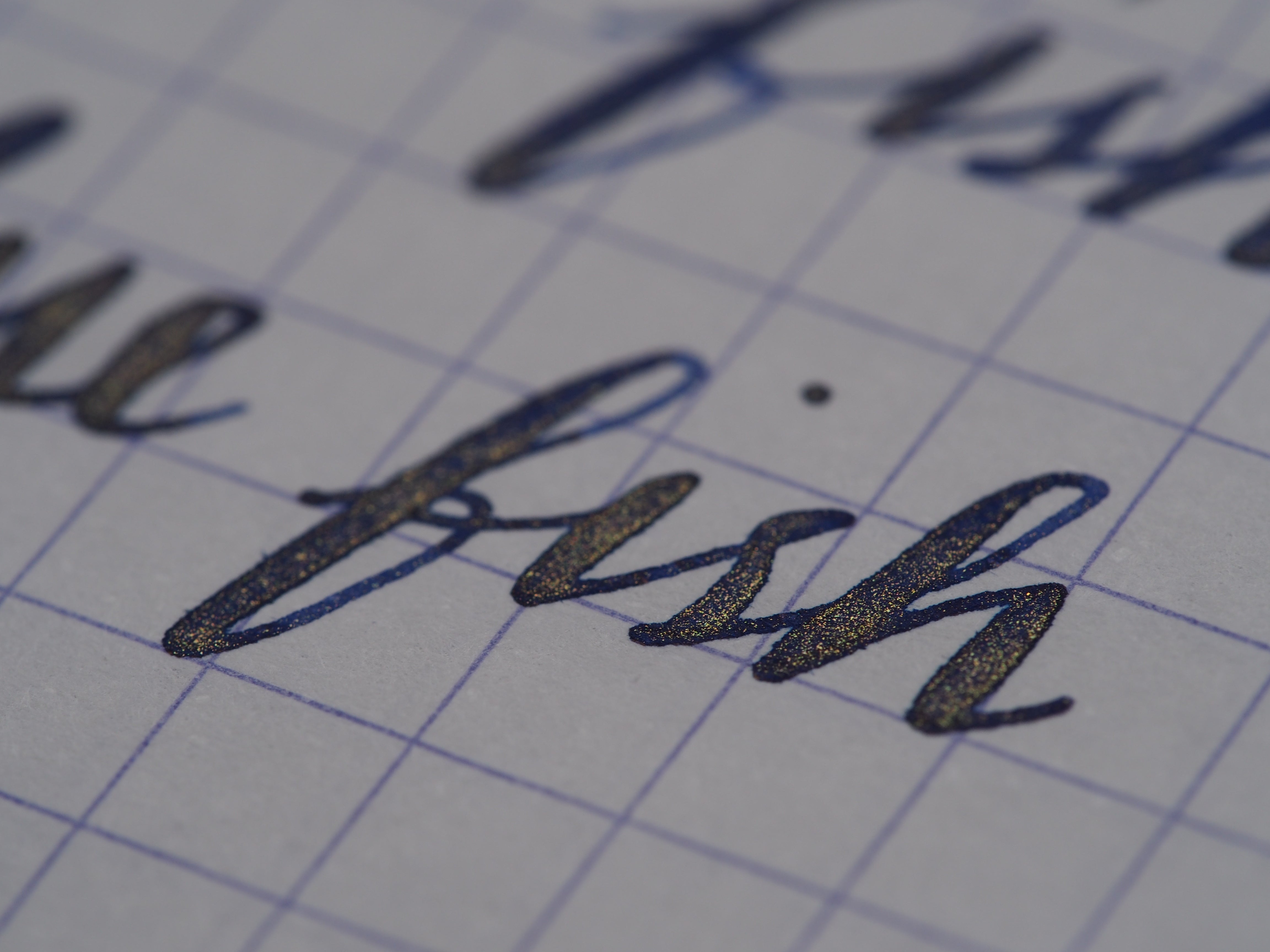
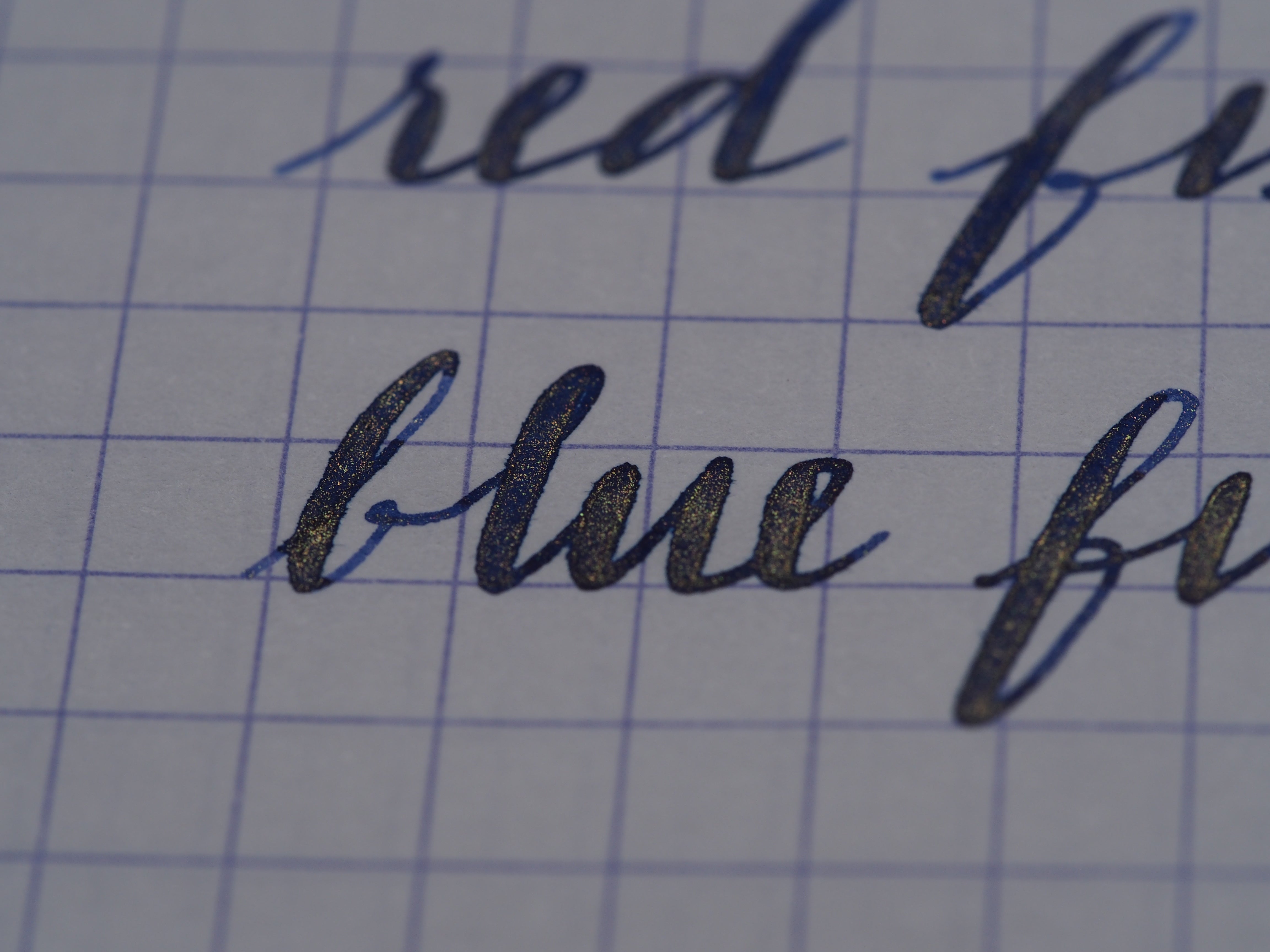
 They've just released this new Bleu Ocean, which is a blue with gold flakes. One day I'm going to convince Jon I need an Ahab for each of these inks and do some side by side comparisons, but for now I just have the one Ahab, and I don't think I can bear to flush out this Bleu Ocean in it right now...
 It's a dark, rich blue, but really, if you're getting this ink, it's for those gold flakes...

 The writing samples above were with my old trusty Ahab, on Rhodia 80gsm paper.
 Even just the bottles for these 1670 Anniversary Inks are beautiful! It's a square bottle with a thick, heavy glass base. It has a waxed cap and also a wax seal on the front with the 1670 imprint. The wax on the cap is pretty soft, so you will probably be able to open it without breaking or cracking the cap.
 This is "perfect" for a work ink with a little pizzazz - you know, if your boss can handle a little shimmer in life :) And, as a side note, after we posted the video of the moving of the furniture to set up the shop, we've had a few customers comment to Jon that they were impressed by all the furniture moving he did and how manly he is and how tired he must be. Jon has just accepted these compliments like there's nothing to it. I just want to point out that while it appears that Jon is doing most of the moving, if you look closely at 0:58 of the video, there is some mysterious ghost moving that vintage sewing desk around, and that ghost would be ME. That's right, me, moving furniture, while taking pictures. Multi-tasking.


Comments
Anonymous said:
I’m glad you’re liking the Stormy Grey! It is indeed a bit darker than many other grey inks, which I think is a part of why the gold also looks so great in it! It’s one of my favourite inks, but of course, now I’m playing around with this blue, haha :)
markbee said:
I’m really looking forward to this ink. I picked up the grey version on Sunday and put it into a Kaweco Dia2 with a medium nib. I was initially concerned that it be too light, but its actually darker than I had expected, and it is very clearly readable. I think it’ll be in my regular rotation for a while to come.