I'm a big fan of Rohrer & Klingner inks:
Alt-Goldgrun,
Leipziger Schwarz,
Konigsblau,
Salix...the list goes on. I like their colours are just a little unusual - their Leipziger Schwarz has just a hint of a bluish black to it to give it a bit of character, Alt-Goldgrun is a green in its own class. Jon keeps reminding me that I need to branch out, and I'm working on it...
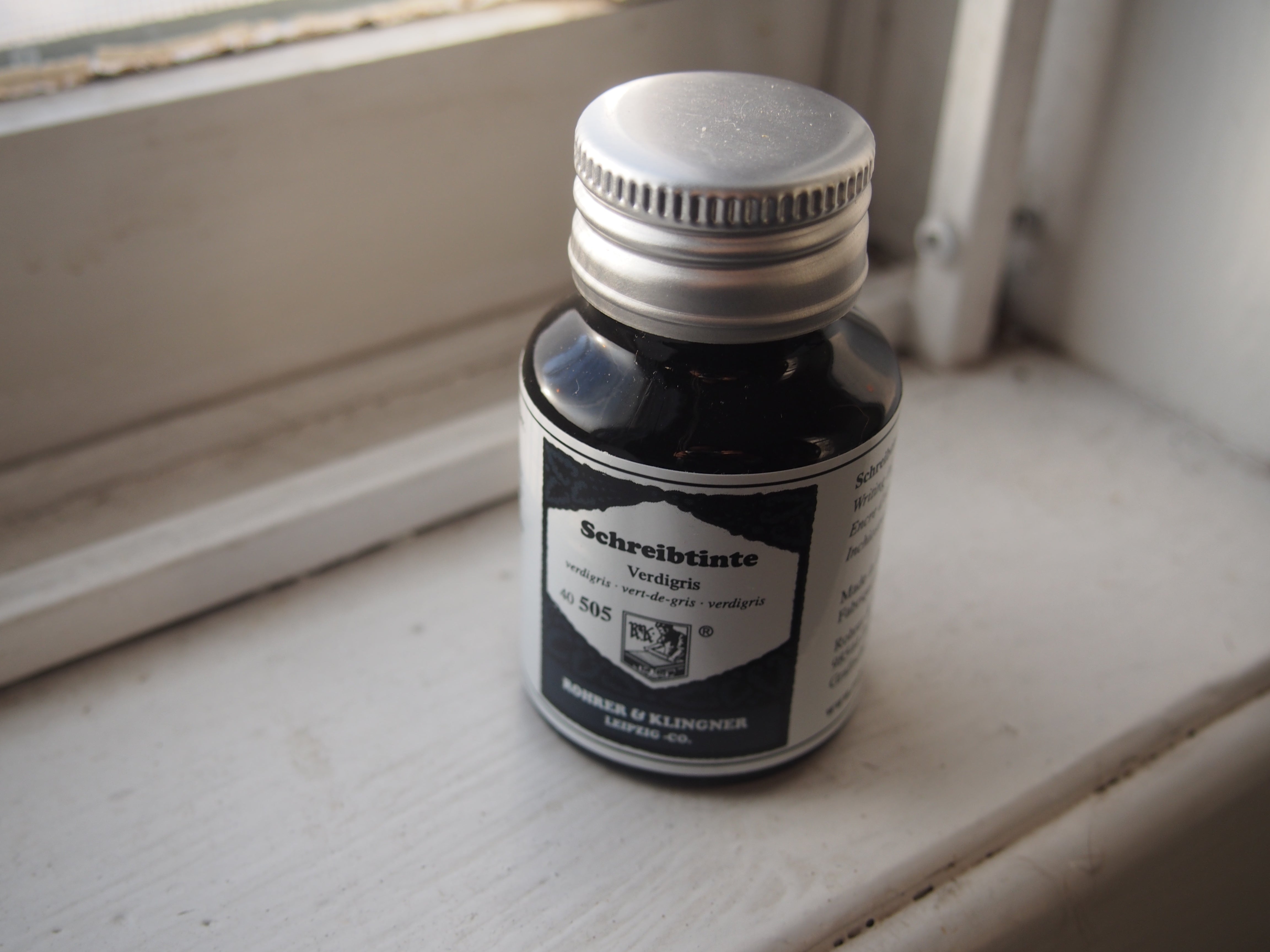
Rohrer & Klingner's Verdigris is another of these inks that just has a hint of something interesting to it- it's a bluish teal colour, kind of a blue-green, not quite your standard dark blue ink. The word verdigris refers to the patina through oxidization of copper or brass or metals, and the
Wikipedia page for this term actually has a picture of the Statue of Liberty as a reference, which is almost turquoise. While the ink isn't supposed to really be a true blue, it can look like a dark blue in writing with a nib if you just glance at it.
It's got very good drying time, even on Rhodia paper (like this review), and it's a "serious" ink, so it's an option for the workplace. It won't be terrific on cheaper papers, but it's not bad with feather or bleedthrough - I would consider this a fairly well-behaved ink. However, if you are using it with considerably cheaper paper, you may want to consider a finer nib. It is not very water resistant at all, although it may stand up to a few splashes of coffee.
It's a pretty good shader, especially as you get to the broader nibs, but even on finer nibs, there's a bit of character. While a lot of artists and writers come in needing the darkest black, without a hint of shading, I think I have a soft spot for shading inks,
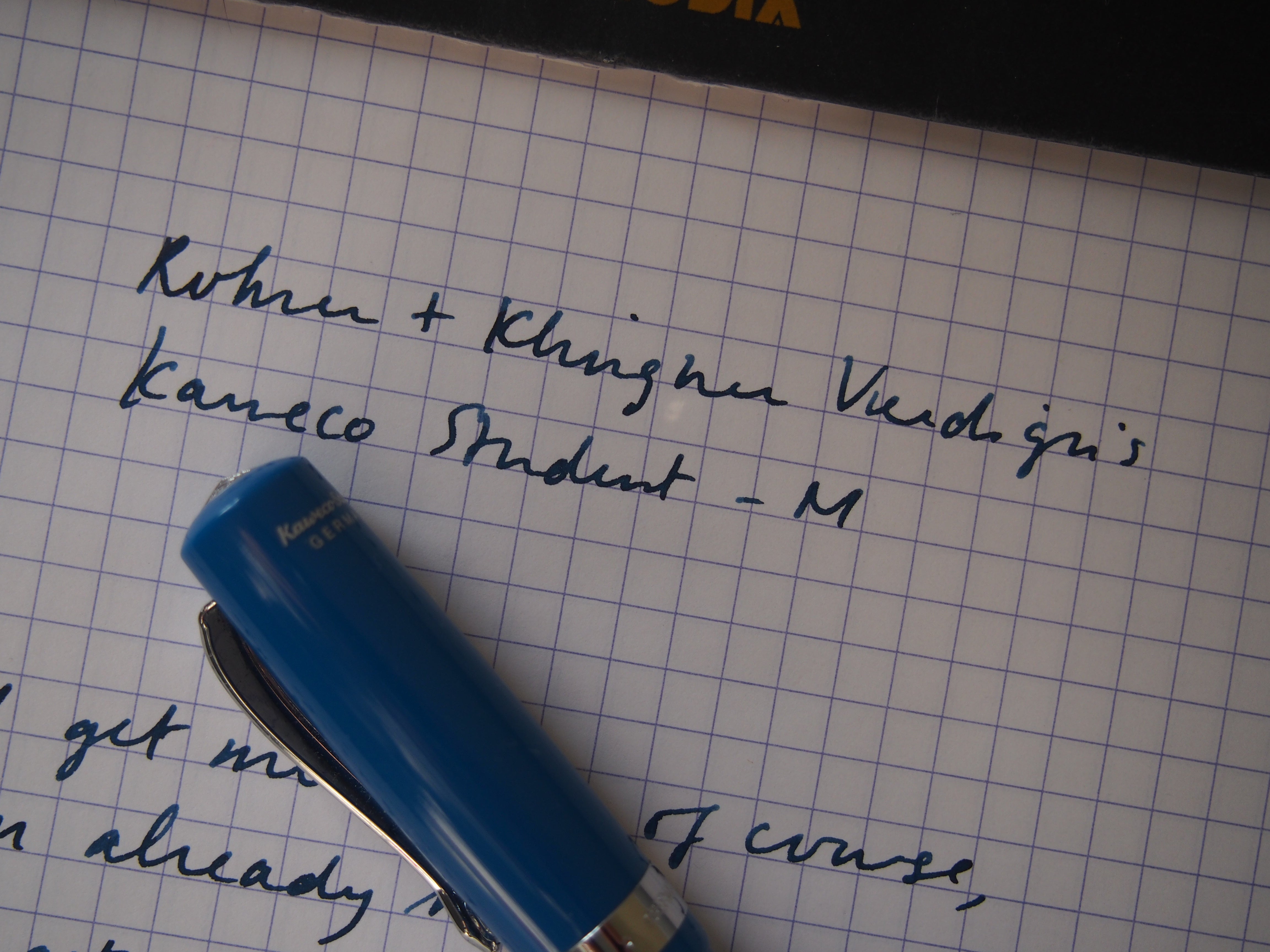
The pen used is a
Kaweco Student with a medium nib, but of course many of Kaweco's pens share this nib, including the Sport, Al-Sport, Allrounder and Dia2. I've found this pen to be a bit on the wet side, but Verdigris is also a bit on the wet side in terms of flow. Maybe because I work in a pen store so I see all kinds of inks all the time, but I generally like inks that have just a little something different about them.
Verdigris is a great ink in terms of being able to be used in different situations (good flow, dries quickly, doesn't bleed or feather too much) while still having a bit of character to it. *My photos have cut out the attribution for this excerpt- it's from Dr. Seuss's Oh, the Place's You'll Go!
Related Posts
Spring is here and with it I have filled my pens with some fall-inspir...
It’s February, and here I am with a few new inks in my pens.
J. H...
I try to do this post every year, a look at what notebooks and plan...


Comments
Helen said:
How does this compare to the Pilot Iroshizuku in Tsuki-yo?
Anonymous said:
Tsuki-yo is a fair bit lighter, definitely in the teal range, whereas Verdigris is a darker teal-black sort of ink. Hope that helps! (And sorry for the late reply!!)
ปั้มไลค์ said:
Like!! Really appreciate you sharing this blog post.Really thank you! Keep writing.
Anonymous said:
It’s a great colour! A dark blue with a hint of green :)
pensandart said:
I just got this ink sample as part of the Goulet Pens Ink Drop program, and fell in love at first swab – I so didn’t expect it to be so blue! It’s really pretty.
Anonymous said:
I love how this ink has such interesting shading – blue and with just a hint of green as it lightens!
Ruth said:
Yet another colour to add to my Wish List!